Electro’s No Way Home Redesign Still Feels Modern in 2026
When I rewatched Spider-Man: No Way Home in 2026, five years after its release, the thing that stayed with me was not just the multiverse chaos. It was Jamie Foxx’s Electro. I remember the old blue look from The Amazing Spider-Man 2, and I remember how much better the No Way Home version felt. Foxx clearly felt the same way. During a villain panel with Alfred Molina and Willem Dafoe, he compared his new Electro design to the old one and explained why the change mattered. As a longtime Spider-Man fan, I see that comparison as a neat case study in how modern superhero movies handle character design. It is also a reminder that nostalgia works best when it is willing to revise the past.
A brand new start
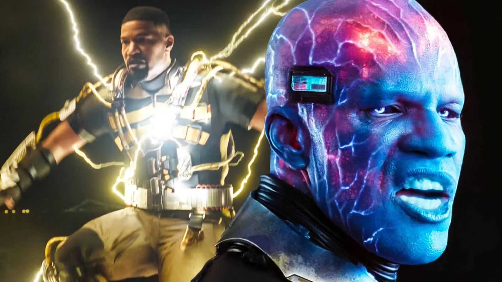
Foxx was direct about the upgrade. He said he was happy to get a brand new start and a brand new look. The old blue version, in his view, was something he accepted because he was simply happy to be part of the movie. He recalled that the blue makeup took two or three hours to apply. With the new version, he said, it was fly. His friends finally said, OK we get you now. When he was blue, they still rolled with him, but they also said, OK you blue. The new design, by contrast, felt more comfortable, more modern, and less like he was trying too hard.
I love the R&B analogy he used. Foxx said old-school R&B used to require fringes on your outfit and shoulder pads and things, while now you can just sing. That is exactly how I read the Electro redesign. The old look was costume spectacle. The new look is performance. It lets Foxx carry the character with presence rather than hiding him under a mountain of blue makeup. In 2026, that idea still feels current. Audiences are more interested in believable villains than in walking visual gimmicks.
What actually changed
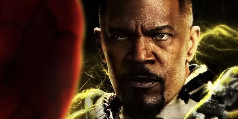
The most obvious difference is simple: the new Electro no longer looks like a blue alien from a cheesy science fiction film. He looks like Foxx wearing some kind of Tony Stark-like tech that allows him to project electrical powers. That streamlined concept fits the MCU’s usual approach. The franchise tends to downplay comic-book weirdness in favor of grounded, believable characters. Foxx seems to agree with that move. The new Electro is less overtly bizarre and more like a human character who can go out and do his thing.
| Element | The Amazing Spider-Man 2 | Spider-Man: No Way Home |
|---|---|---|
| Visual identity | Blue, alien-like, heavy makeup | Human face, sleek tech, controlled energy |
| Preparation | Two or three hours in makeup | More comfortable and practical |
| Tone | Comic-book spectacle | Grounded modern villain |
| Foxx’s view | Happy to be there | Confident and modern |
That table sums up why I think the redesign worked. It is not just about looking cooler. It is about clarity. The new Electro looks like a person with power, not a creature with a color scheme. That makes him easier to read on screen and easier to take seriously.
The multiverse reunion
Of course, Electro was not alone. No Way Home brought back several former Spider-Man villain actors, including Alfred Molina as Doc Ock, Willem Dafoe as Green Goblin, Rhys Ifans as The Lizard, and Thomas Haden Church as The Sandman. The film unleashed the multiverse and all the villainous carnage that came with it. For me, that reunion was more than fan service. It was a chance to do over some character designs and rethink how those villains fit into a new story.
Electro benefited from that chance more than most. The old version fought Andrew Garfield’s Spider-Man in a very different movie era. The new version had to stand beside MCU-style filmmaking, where even absurd powers are presented with a straighter face. I think that pressure helped. Foxx looked happier, and the character felt more intentional.
The grounded-villain debate
There is a real argument that by moving away from the strange and toward the grounded, the MCU takes away some of what makes comic-book villains appealing in the first place. I have made that complaint myself. Grounded does not automatically mean interesting. Sometimes it means boring bad guys in dark jackets. But the point is balance. The best approach is not to erase comic-book weirdness. It is to translate it into something a modern audience can believe in.
In 2026, I think the new Electro sits on the right side of that balance. He is not a blue alien, but he is still an electric villain with a strong visual identity. He is not trying too hard, and that is exactly why he works. Foxx’s R&B comparison keeps coming back to me because it captures the shift so well. The old look had fringes and shoulder pads. The new look just sings. For a character like Electro, that is progress.
Why it still matters
Five years on, No Way Home remains a useful example of how to revisit old villains without simply repeating them. I do not need every comic-book design to become sleek tech. I do want characters to feel like they belong in the story around them. Foxx’s Electro does. He feels more comfortable, more modern, and more today. The old blue look was memorable, but the new one is believable. In my view, that is the right direction. It remains to be seen whether every multiverse return will handle redesign this well, but for Electro, the brand new start was worth it. 🕷️⚡