The MCU's Secret Wardrobe: 10 Rejected Costume Designs That Outshine the Final Cuts
In the sprawling cinematic universe of Marvel, every hero and villain's look is the product of countless iterations, focus groups, and creative debates. While the final on-screen costumes often become iconic in their own right, the cutting room floor of the Marvel Studios art department is littered with designs that, frankly, could have been showstoppers. From villains who missed their chance to look truly menacing to heroes whose classic flair was dialed back, these rejected concepts offer a tantalizing 'what-if' glimpse into an alternate MCU aesthetic. Let's dive into the archives and spotlight the designs that never made it past the concept phase but absolutely should have.
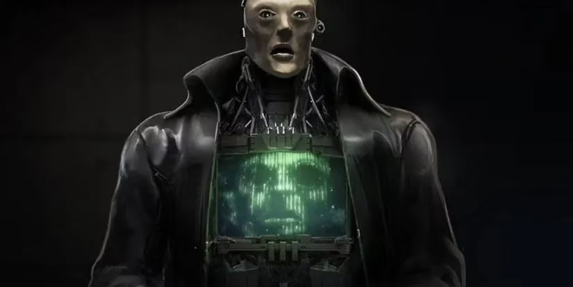
The Robotic Renaissance: Arnim Zola's Lost Body
First up is everyone's favorite digitized Nazi scientist. While his disembodied face on a computer monitor in Captain America: The Winter Soldier was a clever nod, it was a far cry from his comic book glory. Concept art from Ant-Man reveals a far more ambitious vision: a fully realized, comic-accurate robotic body. This design brilliantly walks the line between cartoonish absurdity and genuine menace, something the MCU version sorely lacked. It's a classic case of playing it safe versus swinging for the fences. The final choice was fine, but this? This would have been next level.
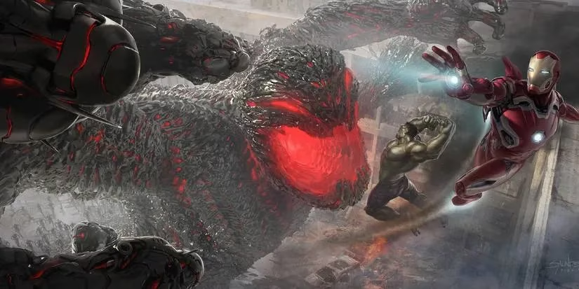
MegaUltron: The Kaiju-Sized Threat That Never Was
Remember when the Avengers: Age of Ultron trailers promised a horror movie villain? Yeah, we were all hyped. The final film, however, served us a quippy robot with daddy issues. Early concept art, however, shows the terrifying climax we were robbed of: MegaUltron. This design envisioned thousands of Ultron drones swarming together to form a Godzilla-sized behemoth. Talk about a final boss! 🤯 While logistically it might have made the street-level heroes feel useless, the visual spectacle alone would have been worth the price of admission. It's the kind of comic book insanity that makes you go, 'Wow, they actually almost did that.'
Gorr the God Butcher: Finding the Middle Ground
Christian Bale gave it his all in Thor: Love and Thunder, but his villain was visually... human. The comic book Gorr is a pale, noseless alien with head tentacles. Concept artist Aleksi Briclot found the perfect sweet spot. His design gave Gorr pale, armored plating with black necrosword accents and smaller, more expressive head tentacles. It maintained Bale's haunting performance potential while making him look truly otherworldly. This was a missed opportunity to create a visually distinct and memorable villain, proving that sometimes, the middle path is the most effective.
MODOK's Slightly More Palatable Proportions
Let's be real, MODOK was always going to be a tough sell. But the Quantumania version, with its overly stretched CGI face, was a bridge too far for many. Aleksi Briclot (him again!) offered a subtler take. His concept art gave MODOK slightly more normal proportions and a face that was scarred rather than grotesquely elongated. It kept the essential silliness of the character but in a way that might have been easier for audiences to digest. A small tweak with a potentially big impact on reception.
Green Goblin's Masked Upgrade
Willem Dafoe's Green Goblin is legendary, but his MCU return in No Way Home had him rocking a makeshift hoodie over his old suit. Cool, but concept art revealed an even better idea: a Dark Elf mask from Thor: The Dark World. The lore suggested Damage Control would have supplied it, completing Norman's transformation into a truly goblin-esque figure. This small addition would have been a genius piece of universe connectivity and given us the most comic-accurate Goblin mask yet. A no-brainer that somehow got scrapped.
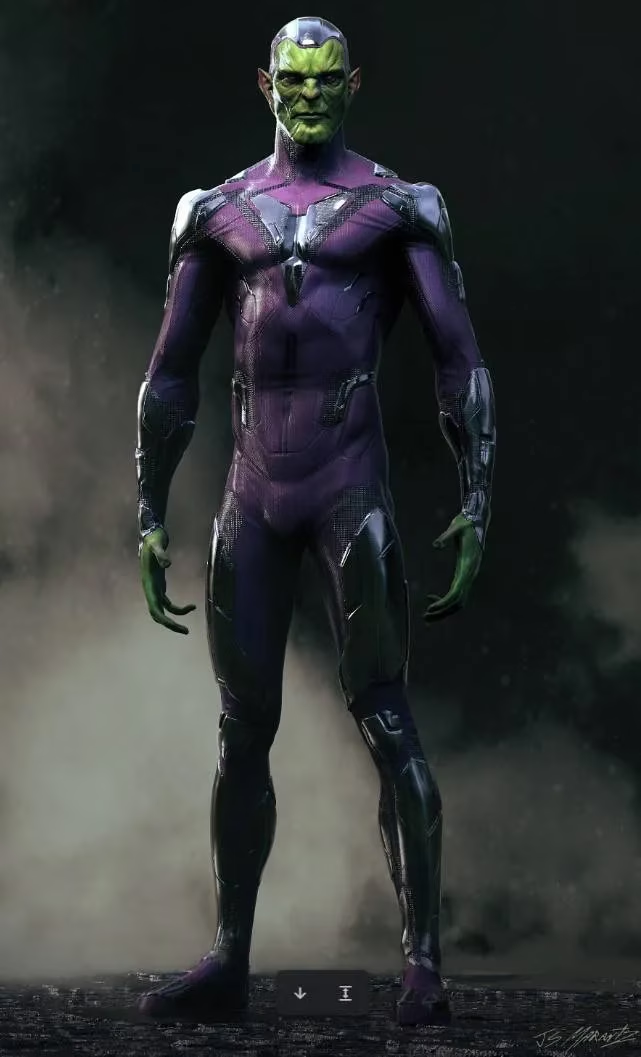
Skrulls in Vibrant Purple
The Skrulls in Captain Marvel looked great... from the neck up. Their drab, utilitarian outfits lacked the pizzazz of their comic counterparts. Concept artist Jarad Marantz shared designs featuring the bright, simple purple outfits the shapeshifters are known for. While the muted movie look works for a grounded spy thriller, a pop of this classic color would have been a fantastic Easter egg for hardcore fans. Sometimes, a little color goes a long way.
Black Panther's Classic Cape
T'Challa's suit is flawless. But what about his father? In a flashback in Black Panther, T'Chaka wore a cool suit with a sash. However, concept art from visual development director Andy Park shows he almost sported Black Panther's iconic collared cape. For a brief, regal flashback scene, this would have been the perfect homage to the character's long history. It screams 'classic Marvel' and would have added a layer of timeless tradition to Wakandan royalty. Pure, uncut superhero majesty.
Malekith: From Bland to Grand
This one still hurts. Malekith in Thor: The Dark World was a pale, forgettable shadow of his comic self. Andy Park's concept art presents a version that is instantly recognizable: darker, more menacing, and far more visually interesting. With a design closer to his two-toned comic appearance, he could have been a formidable foe instead of a narrative afterthought. It's the clearest example on this list of a design downgrade for no apparent reason.
Dormammu's Humanoid Horror
The disembodied, rippling face of Dormammu in Doctor Strange was trippy and effective. But concept art from Jerad Marantz revealed a version that blended that cosmic scale with a more classic, humanoid body from the comics. With the Dark Dimension teased for a return, this design could still see the light of day. It offers a more tangible, and therefore potentially more frightening, form for the mystical entity. A best-of-both-worlds approach.
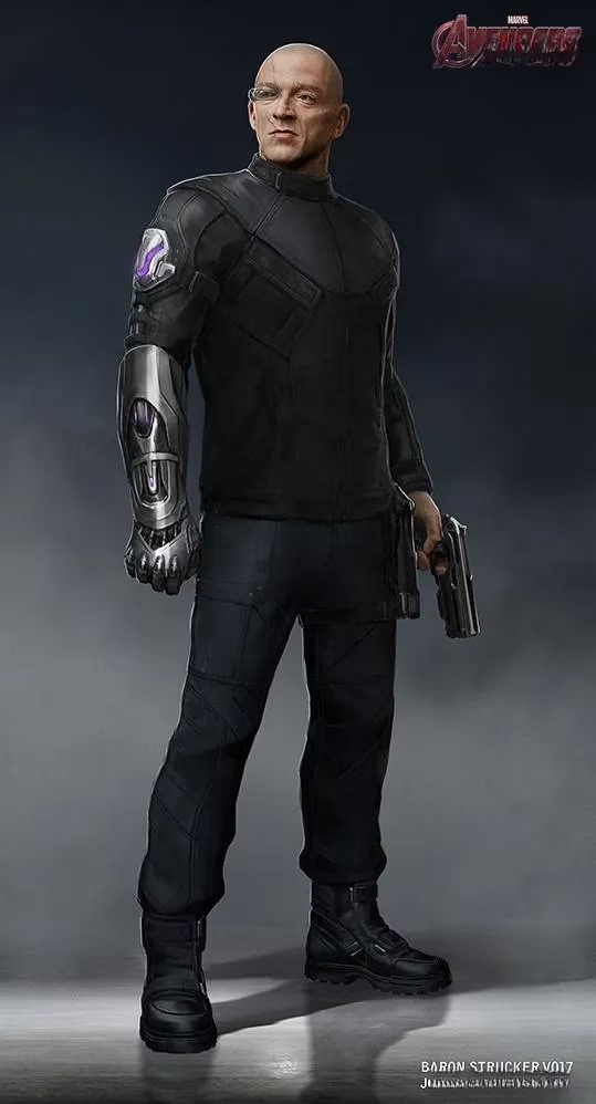
Baron Strucker's Satan Claw
Poor Baron Strucker. He showed up, held the Mind Stone, and got unceremoniously killed. He never got to show off his signature weapon: the 'Satan Claw' gauntlet. Concept art from Josh Nizzi showcases this iconic piece of kit, which grants super strength and houses various weapons. It's speculated it was cut due to similarities with Ulysses Klaue's sonic arm, but that's a bummer. Giving Strucker this tool would have instantly made him more than just another Hydra suit and honored his comic book legacy.
The Bottom Line
So, what's the takeaway from this treasure trove of unused art? The MCU's design process is a complex beast, balancing comic accuracy, cinematic practicality, actor mobility, and mass audience appeal. These rejected designs remind us that for every iconic suit we see, there's a team of artists pushing boundaries and exploring wilder ideas. While not all of them are practical, they represent the creative heart of the universe. As we move into 2026 and beyond with new sagas and characters, one can only hope the studio occasionally lets its freak flag fly and embraces some of that glorious, unapologetic comic book weirdness. After all, that's where the magic truly happens. 🎨✨